One of the things I love is to improve and optimize things. Kartones.Net is the best example, and although I usually only use the "news twitter account" to notify of improvements (and most times just don't say anything), at least once a month I try to make modifications to the Community Server engine to adapt it more to the portal objectives.
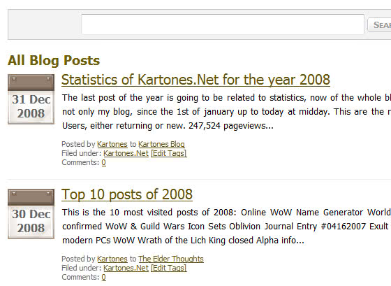
One of the things I didn't liked about CS is how the main post list presented the latest posts, giving focus to comment count and ratings (which are disabled in our community). In my opinion it is better to see the date of posts, and leave the comment count to the details (in smaller font).
So, after a bit of ASP.NET controls reorganization and CSS changes, now I've learned how to modify the post list and achieved giving focus to the post dates:

Now it is way easier to see the dates of the posts, and comment count is still there but smaller. I've also improved speed internally by removing unneeded checks (CS sometimes does too many things for simple tasks).
From now on, I'll probably post some changes I make to the portal (and not just to the addon pack) just in case someone else has a Community Server portal and wants to see how to customize or adapt it to their needs.
Tags: Kartones.Net UX